Alt Text Examples: Good, Bad and Why It Matters

Most advice on alternative text stops at “describe the image”. That is correct and almost useless, because the hard part is knowing what counts as a good description for this particular image in this particular place on your site.
So this is mostly examples. Each one shows what people usually write, what you can write instead, and why the second version is better for your users.
Why alt text matters for accessibility
Alternative text is first and foremost an accessibility feature, and understanding which users rely on it makes the examples below much easier to judge. Accessibility is the context that explains every rule here.
Screen reader users rely on your alt text to know what visual content a page contains. Without a description, an image is either skipped entirely or announced as a filename, which turns your carefully chosen photo into “DSC underscore zero zero four eight dot jpg”. For a website built around images, that can make whole sections meaningless.
Other users benefit too:
- People on slow connections, where images fail to load and the alternative text appears in their place.
- Users who have disabled images to save data, which is still common on mobile.
- Anyone using a text-only browser or a voice assistant to read a page aloud.
Accessibility standards treat this as a requirement rather than a nicety. WCAG expects non-text content to have a text alternative that serves the equivalent purpose, and public sector websites in many countries are legally bound by it. Accessibility audits check your alt text first because it is the fastest thing to measure.
The SEO benefit is real but secondary. If you follow accessibility best practices, the SEO side takes care of itself, and your description will be better than anything written for a crawler. Good accessibility and good SEO point in the same direction here, which is not true of every optimisation.
The one rule everything else follows
Alt text exists so that someone who cannot see the image still gets what the image was there to give them. Not a description of the pixels. The information.
That distinction decides every example below. The same photograph needs different alt text depending on whether it illustrates an article, sits inside a button or repeats a caption that is already on the page.
Search engines read your alt text too, which is why it can be found in every SEO checklist. That is a side effect and a useful one, but if you write alt text for a crawler rather than a person, you will usually get it wrong for both.
Alt text examples for photographs
This is the most common case on any website and the one people overthink. These examples follow the same best practices throughout.
| Instead of | Write |
|---|---|
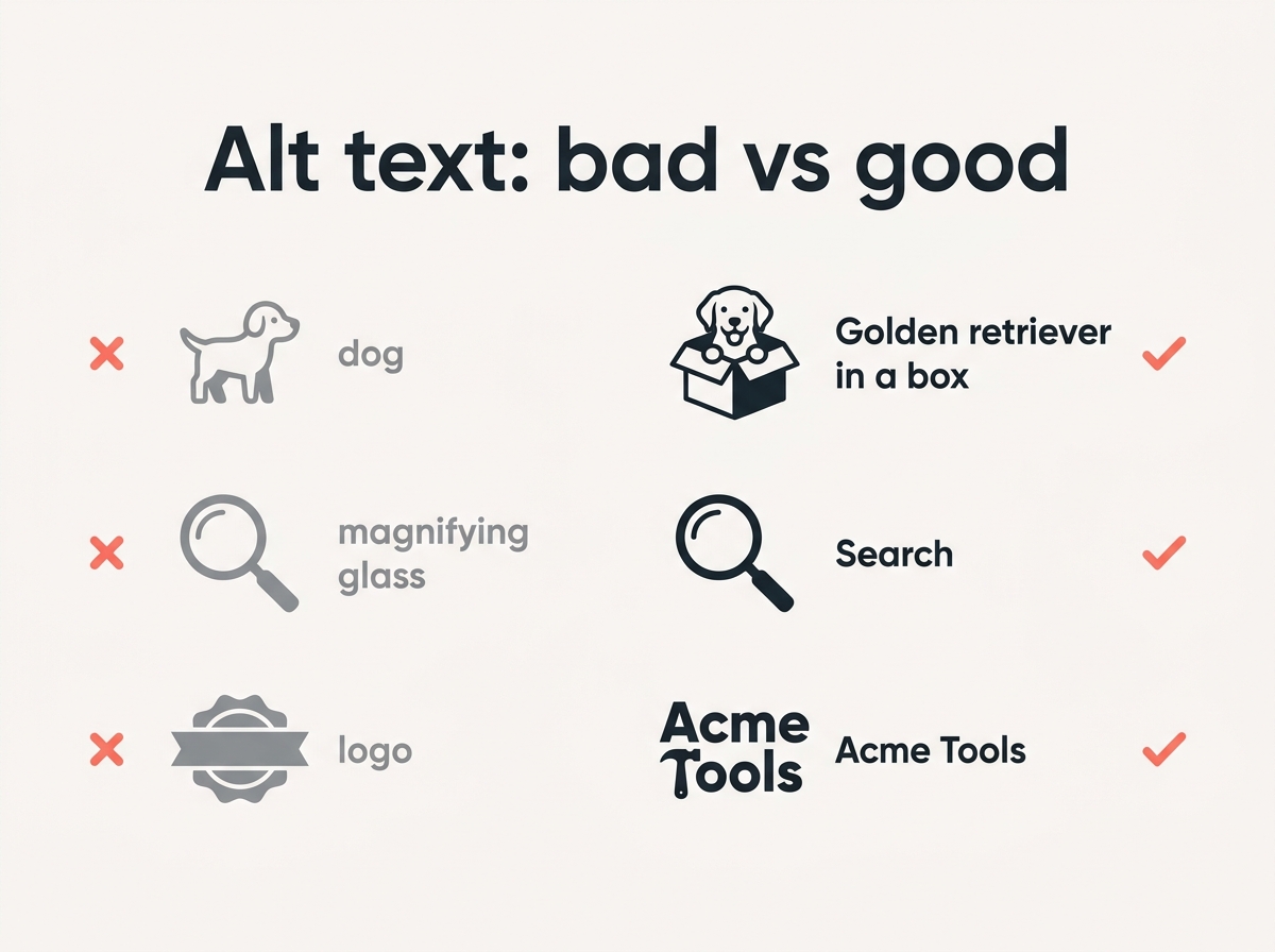
| `alt=”dog”` | `alt=”Golden retriever puppy sitting in a cardboard box”` |
| `alt=”image of a laptop”` | `alt=”Laptop showing a spreadsheet of monthly expenses”` |
| `alt=”team”` | `alt=”Four colleagues standing around a whiteboard covered in sticky notes”` |
| `alt=”food”` | `alt=”Overhead view of a brunch table with pancakes, berries and coffee”` |
Two habits to drop. Do not start with “image of” or “picture of”, because a screen reader has already announced that it is an image and you are spending the listener’s attention on nothing. And do not write a single generic noun, because “dog” tells somebody that a dog exists, not what the picture shows.
How long is right? Aim for one clear sentence. Screen readers can cut alt text off at around 125 characters, so treat that as a practical ceiling rather than a hard rule.
Alt text examples for logos
A logo is almost always a link to the homepage, which changes what the alt text should say.
“`
Bad: alt=”logo”
Bad: alt=”company logo png blue”
Good: alt=”Acme Tools”
“`
The alt text of a linked logo should be the name of the thing it links to. Somebody navigating by links hears “Acme Tools, link” and knows exactly where it goes. Writing “logo” gives them “logo, link”, which tells them nothing.
If the logo is not a link and sits in a footer next to the company name already written in text, it is redundant and gets `alt=””`.
Alt text examples for icons and buttons
Here the image has a job rather than a subject, and your alt text should describe the function. These are functional images, and the description you can give should match what happens when a user activates them.
| Image | Bad | Good |
|---|---|---|
| Magnifying glass in a search button | `alt=”magnifying glass”` | `alt=”Search”` |
| Printer icon on a print link | `alt=”printer icon”` | `alt=”Print this page”` |
| X in the corner of a dialog | `alt=”x”` | `alt=”Close”` |
| Envelope on a contact link | `alt=”envelope”` | `alt=”Contact us”` |
Describing the picture instead of the function is the single most common mistake in this category. Nobody needs to know the button shows a magnifying glass. They need to know it searches.
How context changes the alt text
The same photograph can need four different descriptions, and this is the part that trips up anyone writing alt text from a checklist.
Take one image: a woman in a hard hat pointing at a blueprint on a building site.
| Where it appears | Alt text |
|---|---|
| Article about construction safety | `alt=”Site manager in a hard hat reviewing a blueprint”` |
| Team page, as her profile photo | `alt=”Mara Okonjo, site manager”` |
| Link to a case study | `alt=”Read the Riverside project case study”` |
| Decorative banner above unrelated text | `alt=””` |
Nothing about the pixels changed. What changed is why the image is on the page, and the alt text follows that.
This is why automated alt text tools can only take you so far. They can describe the content of an image accurately and still produce the wrong description, because they cannot know what the image is doing in your layout. Use them as a first draft and edit for context.
A practical way to decide: ask what a user would lose if the image vanished. If they would lose information, describe the information. If they would lose a link target, describe the destination. If they would lose nothing, the image is decorative.
Decorative images and empty alt text
Some visual content carries no information at all. A divider, a background flourish, a stock photo of hands on a keyboard sitting above an article that is not about keyboards.
These get an empty alt attribute:
“`
alt=””
“`
Not a missing attribute. An empty one. The difference matters: with `alt=””` the screen reader skips the image silently, while an image with no alt attribute at all often gets read out as its filename, which is the worst outcome of all.
The W3C’s alt decision tree is the reference worth bookmarking here. It sorts images into informative, functional, decorative, redundant, complex and text-containing, and gives the empty alt to decorative images, to images whose text already appears nearby, and to images that simply repeat adjacent text.
That redundant category catches people out. If a photo of a product sits directly above a paragraph describing the product, repeating the description in alt text makes a screen reader say everything twice.
Alt text examples for charts and complex images
A chart cannot be summarised in 125 characters, and pretending otherwise helps nobody.
“`
Bad: alt=”chart”
Bad: alt=”bar chart showing data about our quarterly performance over time”
Good: alt=”Bar chart of monthly signups, described in the text below”
“`
Then put the actual finding in the surrounding content, where all your users benefit from it:
Signups grew steadily from January to August, then dropped sharply in September when the pricing page changed.
That sentence helps screen reader users, search engines and the sighted reader who glanced at the chart and did not parse it. Accessibility and SEO are served by the same description. Putting your analysis in alt text hides it from most of your audience.
Alt text examples for product images
E-commerce has its own trap, which is cramming every attribute into the alternative text. A good description names what you can actually see.
| Instead of | Write |
|---|---|
| `alt=”shoes”` | `alt=”Navy canvas sneakers with white rubber soles”` |
| `alt=”running shoes buy cheap running shoes best running shoes 2026″` | `alt=”Navy canvas sneakers, side view”` |
| `alt=”product image 3″` | `alt=”Navy canvas sneakers, close-up of the stitched toe cap”` |
When a product has several photos, the alt text should distinguish them. “Side view”, “sole detail”, “worn with jeans” are all more useful than repeating the product name four times.
Images of text
If an image contains words, those words belong in the alt text.
A quote graphic reading “Design is how it works” gets `alt=”Design is how it works”`, not `alt=”quote graphic”`. A screenshot of an error message gets the error message.
The better answer, where you can manage it, is to not put text in an image at all. Real text is selectable, searchable, translatable and resizes properly. An image of text is none of those things.
Screenshots
Screenshots need more thought than photographs because what matters depends entirely on why you included it.
“`
Bad: alt=”screenshot”
Bad: alt=”screenshot of the settings page”
Good: alt=”Settings page with the Enable notifications toggle switched on”
“`
Describe the content you are pointing at, in the context of why you included it. If you included the screenshot to show where a button lives, say where the button is. If you included it to show an error, quote the error.
Alt text and SEO best practices
Alt text helps search engines understand your visual content, which matters for image search and gives the page a little more context. That is the entire SEO story, and it is smaller than most guides imply.
What does not work is stuffing. An alt attribute reading “cheap flights cheap flights to paris book cheap flights” is read aloud in full by a screen reader, which is both useless and unpleasant, and search engines have ignored that pattern for over a decade.
Include your keyword when the keyword honestly describes the image. Leave it out when it does not. Our guide to image SEO puts alt text in context alongside the things that move rankings more, like file size and format.

Common accessibility mistakes
Five patterns account for most of the alt text that fails real users, and each one is an accessibility problem before it is an SEO problem.
- No alt attribute at all. Screen readers fall back to reading the filename, so your visitors hear a string of numbers. This is worse than an empty alt and far more common than it should be.
- Describing the format instead of the content. “jpg”, “banner”, “graphic” and “photo” describe how the file was made, not what it shows.
- Repeating the caption word for word. If a caption sits visibly under the image, screen reader users get the same sentence twice. Either vary the alt text or leave it empty for genuinely redundant images.
- Writing for SEO rather than for people. Keyword lists in alt text are read aloud in full. They were an SEO tactic a decade ago and are now just an accessibility problem.
- Forgetting images inside links and buttons. These need the function, not the picture, and missing alt text here can make navigation impossible.
None of this content takes long to fix, and the accessibility gain is immediate. The difficulty is noticing, which is why reading the page aloud with the images replaced by their descriptions works better than any checklist.
A quick checklist
Before publishing, run through your images:
- Does every meaningful image on your site have alt text that says what it shows or does?
- Does every decorative image have `alt=””` rather than no attribute?
- Did you remove “image of” and “picture of” from the start?
- Is each one roughly a sentence rather than a paragraph?
- For linked images, does the alt text describe the destination?
- For charts, is the actual finding written in the page text?
Before you upload
Writing your alt text is the last step, not the first. An image that is 4 MB and 4000 pixels wide will slow the page down regardless of how well you describe it.
- Scale it with the image resizer to the width it will actually display at.
- Shrink the file with the image compressor.
- Convert it with the format converter, since WebP typically halves the size.
All three run in your browser, so nothing is uploaded anywhere on the way.
Quick answers
How long should alt text be?
Around one sentence. Screen readers may cut off at roughly 125 characters, so treat that as the practical limit.
Do I need alt text on every image?
Every image needs an alt attribute. Decorative images need an empty one, written as `alt=””`.
Should alt text contain keywords?
Only when the keyword genuinely describes the image. Forcing it in makes the text worse for everyone and does nothing for rankings.
What is the difference between alt text and a caption?
Alt text replaces the image for people who cannot see it. A caption sits visibly under the image and is read by everybody. They serve different jobs and should not be identical.
What alt text should a logo have?
The name of the organisation if the logo links somewhere, since the alt text describes the link destination. An empty alt if the name already appears as text beside it.
The test that settles most cases
Read the page aloud, replacing each image with its description. If the result makes sense and nothing important went missing, the alt text is doing its job.
If a sentence suddenly says “image of a dog” or lists four keywords in a row, you have found the one to rewrite.